The Brief
Recognising that Atlantic’s previous brand no longer aligned with its athlete-focused vision, founder Jason knew it was time for a shift. As the gym grew, so did its mission—not just to train world-class athletes, but to develop role models and innovators for the next generation. The rebrand had to capture that evolution.
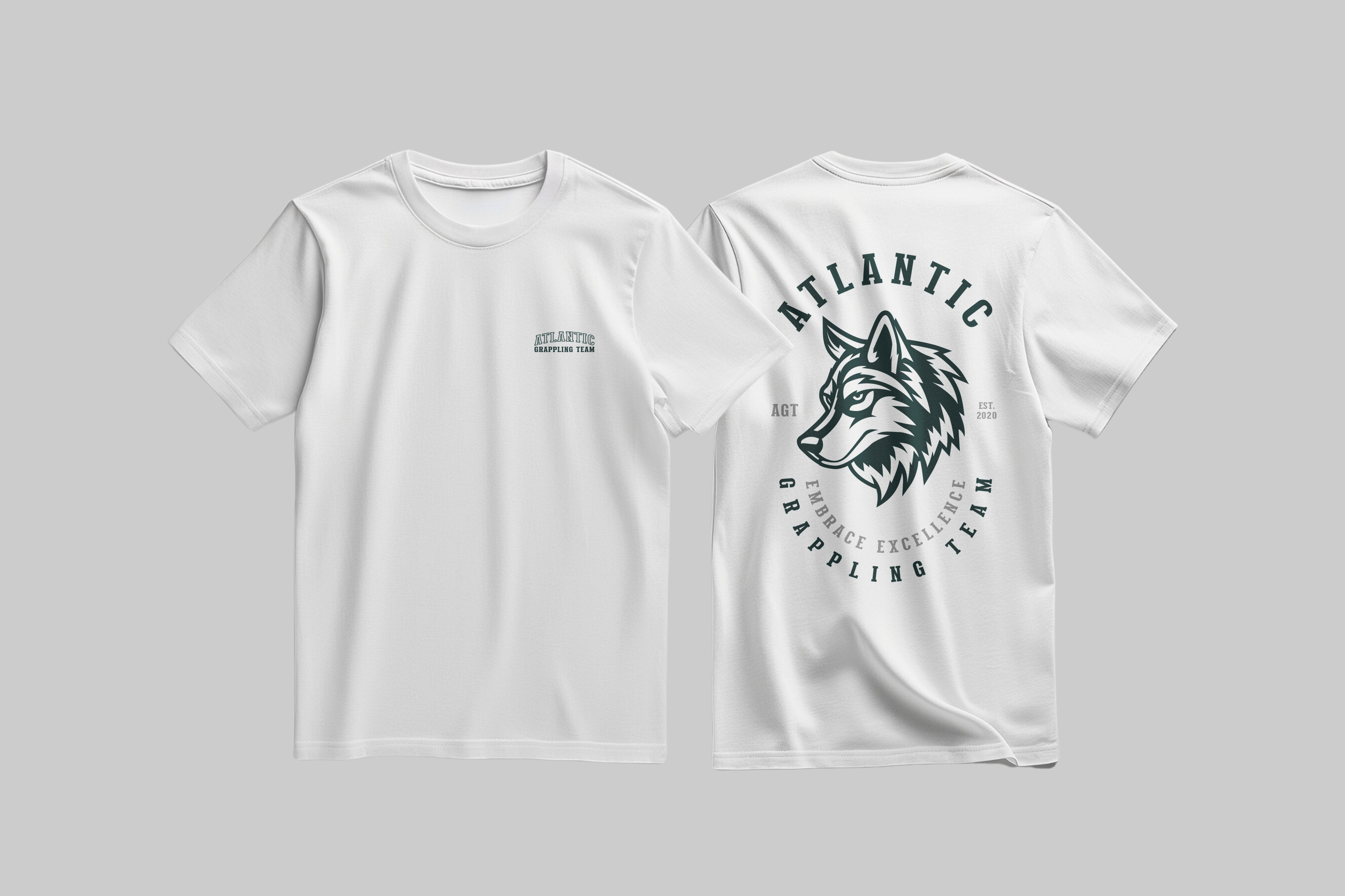
The process was all about creating an identity that matched the athletes' dedication while attracting new members, sponsors, and partners. Every detail was crafted to position Atlantic as a modern leader in grappling and combat sports, and this rebrand became a key step in making that vision a reality
The Concept
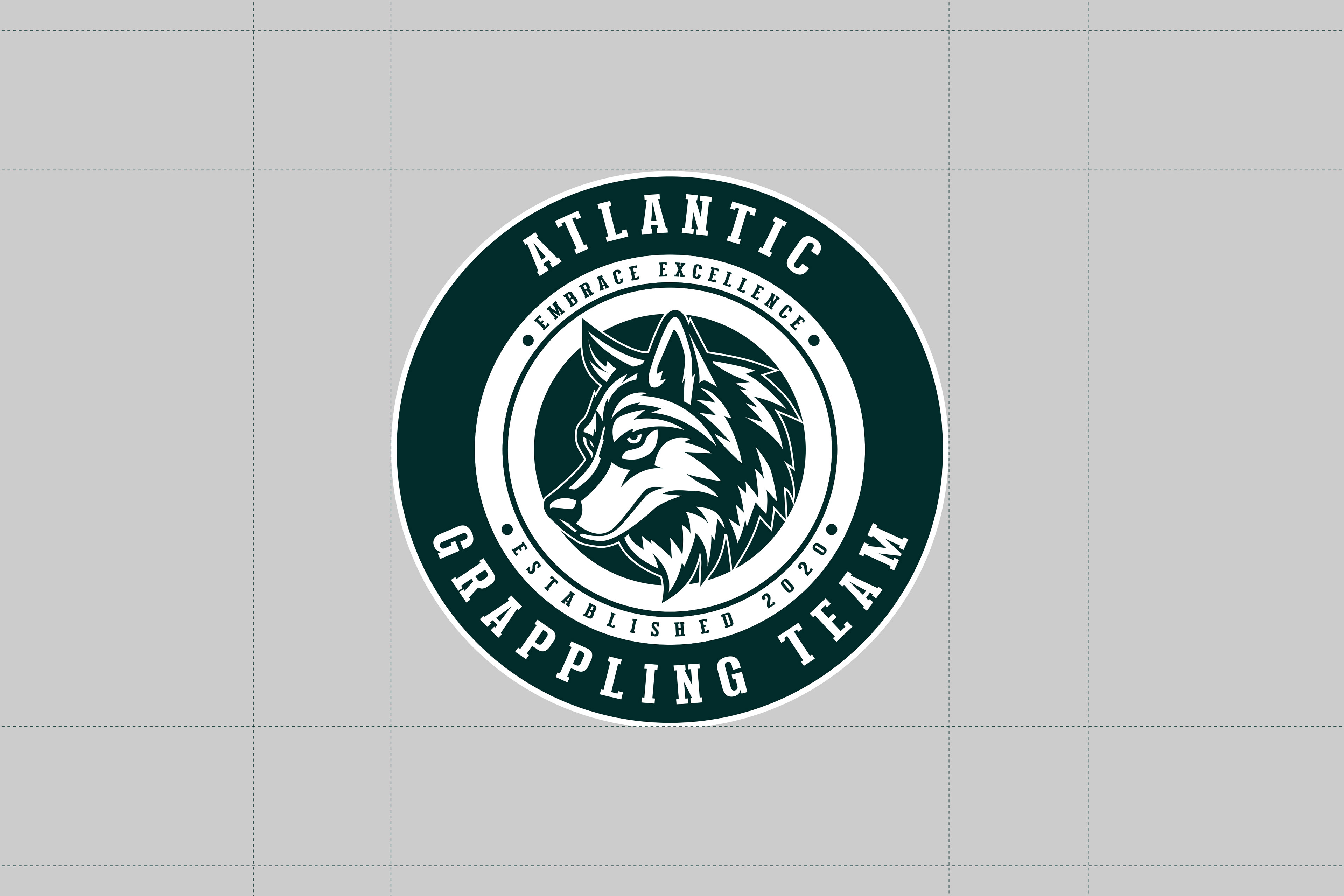
Defining the Atlantic brand identity presented a unique opportunity. The challenge was to create something that went beyond typical sports imagery, offering designs that truly represented the team's spirit. The wolf badge needed to reflect both the strength of the athletes and the visionary leadership of the founder, resulting in an emblem that feels timeless and iconic.
The wolf, placed at the centre of the badge, became the key. It symbolises the unity and heart of the team, anchoring the brand in values like loyalty, resilience, and strength. I spent considerable time refining the design, ensuring every detail reflected the deep-rooted commitment to these ideals. After countless iterations, the final result is a logo that stands out, representing not just a team, but the spirit and vision of what Atlantic is all about.


Type & Colour
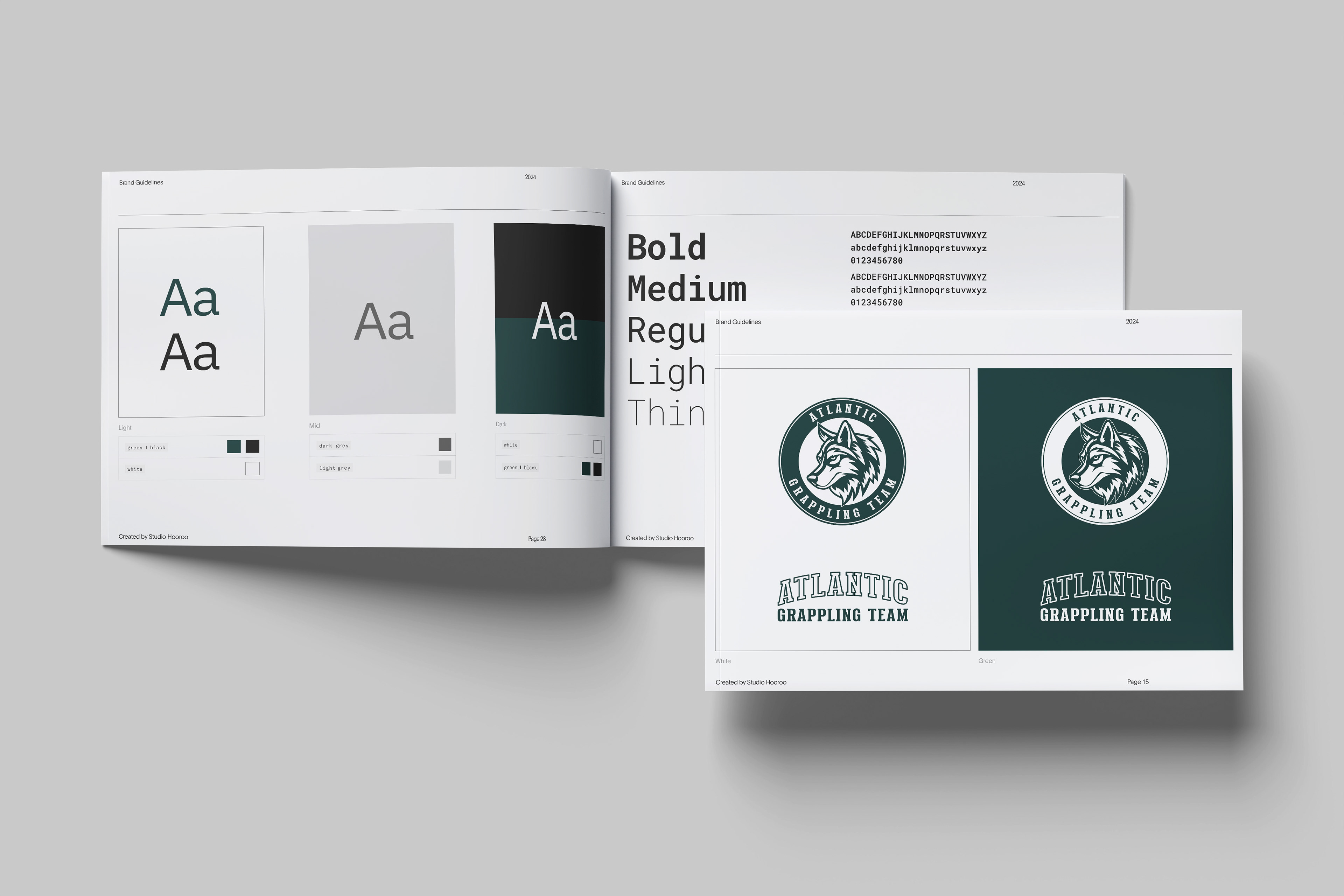
Colour plays an essential role in Atlantic’s identity, with the signature green as a defining feature. Combined with a black and white primary palette and secondary greyscale tones, this combination creates a cohesive and impactful visual presence across all brand elements. The result is a palette that feels bold, balanced, and instantly recognisable across everything Atlantic does.
The typography pairs heritage with modern clarity. A strong collegiate typeface reflects the team’s legacy and strength, while a clean sans-serif ensures sharp, legible communication across all platforms, achieving the ideal balance between tradition and precision`

Testimonial
"Rebranding was a significant move for us as a martial arts team, especially since our previous logo represented an era that we had outgrown. I had been hesitant to engage with a graphic designer due to previous poor experiences where professionals couldn’t quite capture my vision for the brand’s future.
However, from the very first debrief, Sam seemed to understand my brand even better than I did. He outlined a clear process for the coming weeks, helping me gain a deeper understanding of my own brand and ensuring that the final product—a logo—truly represented who we are and where we’re headed. Sam allowed me the creative freedom I wanted while also offering invaluable professional advice. He’s been fantastic, and I couldn’t recommend him more to anyone looking to rediscover their brand.
He provided a clear path forward with a complete brand outline that effectively represents our vision and positions us to market it successfully. Look no further."
Jason Phi - Director, Atlantic Grappling Team
