The Brief
The challenge was to create a brand identity for a business dedicated to products that elevate peak performance and focus, without sacrificing health and wellness. The founder saw a gap in the market—performance-focused individuals needed products that not only enhanced their abilities but also supported their overall well-being. The mission was clear: deliver top-tier products that enable peak performance while maintaining a commitment to natural, balanced solutions.
Building this brand meant tapping into the needs of high-performing individuals who prioritise their health, creating something that truly resonates. In a competitive landscape, the brand had to stand out with a strong identity that communicates quality, trust, and effectiveness.
The Concept
The task of building a brand that balances performance with wellness required finding the right visual identity to communicate that mission. After refining the vision, the result was a brand that offers performance-enhancing products without compromise, positioning itself as the go-to choice for those who demand the best in both performance and wellness.
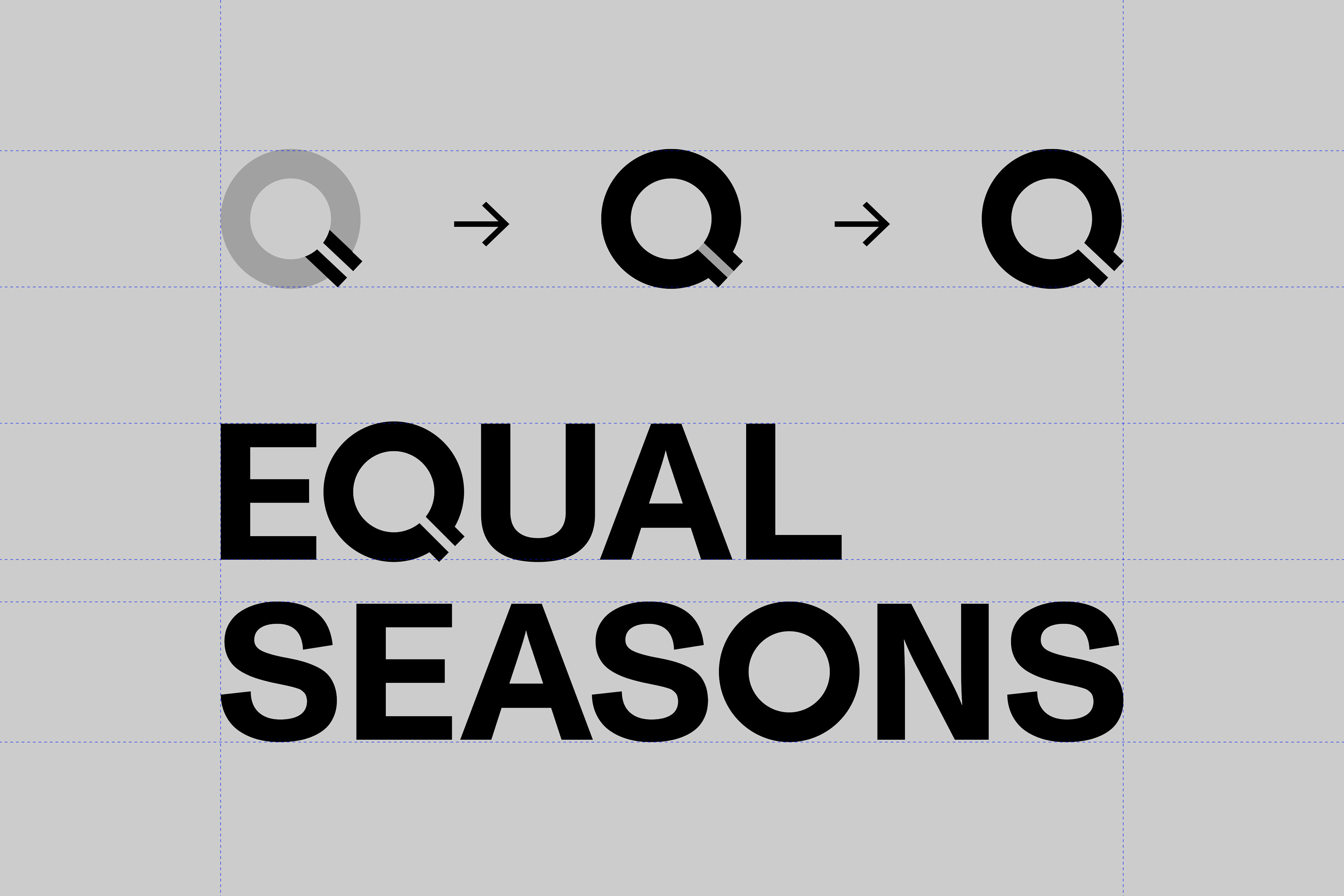
The Equal Seasons logo, featuring the equals sign embedded in the ‘Q,’ was an exciting design challenge. The founders wanted something simple yet meaningful, and this symbol struck the perfect balance. It ties directly into the brand name while embodying the core message—equal focus on peak performance and health. Getting this right took some iterations, ensuring the logo was clean, impactful, and immediately recognisable. In the end, it became a powerful icon that truly reflects the brand’s commitment to excellence without sacrifice.


Type & Colour
Developing the visual identity for Equal Seasons began with careful consideration of typography. The objective was to create a balance between refinement and clarity, ensuring the fonts elevated the brand’s aesthetic while maintaining consistent readability across all mediums and platforms. After exploring various options, the team refined the selection to achieve a polished, functional look that perfectly complemented the brand's identity.
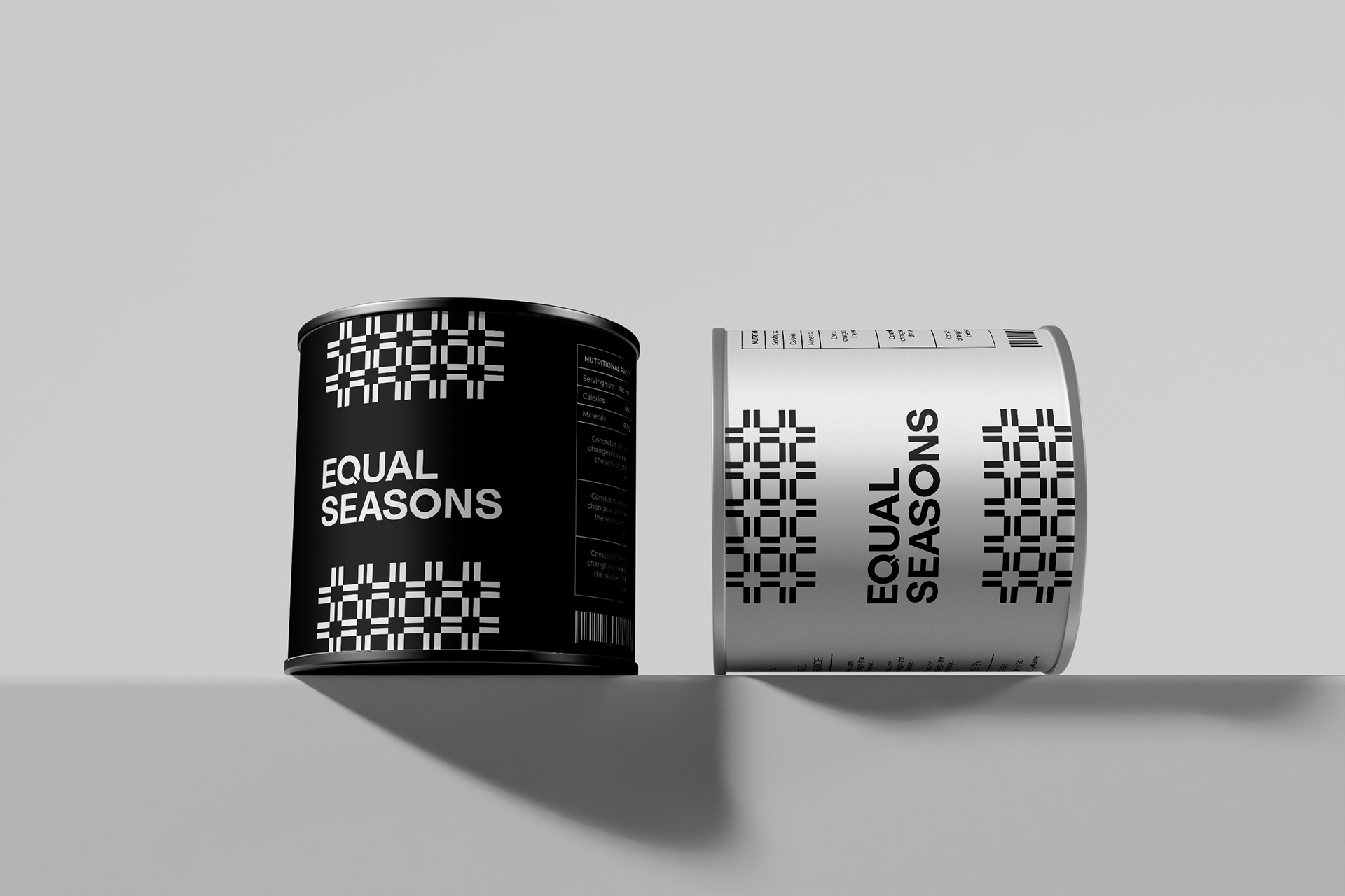
The colour palette played a pivotal role in defining Equal Seasons. The founders envisioned a scheme that blended the depth of sober tones with the subtlety of greyscale. This combination resulted in a unified gradient of shades that flows seamlessly across the brand’s entire visual presence. The cohesive colour scheme not only strengthens the brand’s recognition but also reinforces its core values of balance and peak performance.
Testimonial
"Working with Sam was an absolute pleasure. I was a little apprehensive about hiring a branding agency as I initially thought I may be able to put something together on my own… How wrong I was.
Sam was able to create something so far above and beyond what I would have been able to create on my own and I am absolutely ecstatic with the result. Very glad I pulled the trigger.
The process was highly professional start to finish and I was impressed with the level of detail throughout. The time and attention spent on first understanding the brand, values and tone of voice was a particular standout as I felt this really helped align the design to the vision of the brand I had in mind.
The process was highly professional start to finish and I was impressed with the level of detail throughout. The time and attention spent on first understanding the brand, values and tone of voice was a particular standout as I felt this really helped align the design to the vision of the brand I had in mind.
I’ll certainly be working with Sam on an ongoing basis and would highly recommend him if you are looking to bring your brand to life."
Wade Nicholson - Founder, Equal Seasons